The Flawless-Skin Image Is Not a Baseline
Learn to read flawless-skin imagery by separating lighting, editing, makeup and product presentation from the skin itself, without treating a picture as a standard.
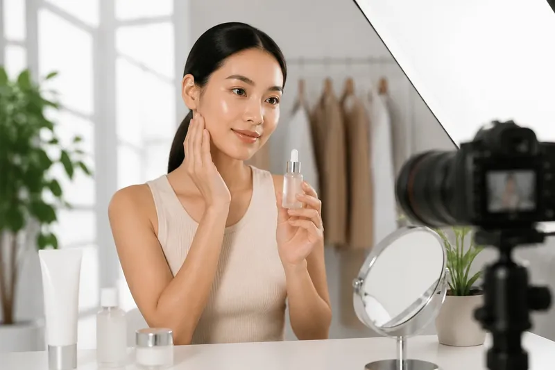
A flawless-skin image is a constructed picture, not a neutral record of ordinary skin. To read flawless-skin imagery critically, look at how light, editing, makeup and presentation shape what you see before deciding what the image implies about a face.
This is not about guessing whether a particular photograph is “real.” A camera image can show a real person and still be carefully arranged. The useful question is narrower: which parts of the polished effect come from skin, and which come from the conditions around it?
What does the image ask you to notice?
Start with the frame, not the pores. Notice where your eye goes first: a glossy cheek, a brightened under-eye, a smooth forehead, or the product held beside the face. Beauty imagery often makes one feature especially legible while letting the rest recede. That emphasis can make a particular finish look like the defining condition of healthy or attractive skin.
Then identify what the image actually promises. A product photograph may be designed to show texture, shade or packaging. A campaign portrait may convey a mood. A routine video may invite imitation. These formats have different purposes, but none is a complete account of how a face looks across ordinary rooms, expressions and hours of the day.
Read the caption and nearby copy as part of the presentation. Words such as “radiant,” “clear” or “smooth” can shift an image from showing a makeup finish to suggesting a skin condition. Ask whether the language describes the visible surface, the product’s intended role, or an ideal that the picture quietly asks you to pursue.
How does lighting change visible skin?
Light can soften texture without changing skin. A broad, diffused source spreads illumination across the face and reduces the sharp shadows that make small bumps, fine lines and dry patches easier to see. A frontal light can also make the face appear more evenly lit than it would under a ceiling fixture or beside a window.
Direction matters as much as softness. Side light makes texture and contours more apparent because it creates small shadows. Light from above can deepen shadows beneath the eyes or nose. A reflector, pale wall or fill light can soften those shadows again. None of these choices is inherently deceptive; each directs attention and sets a visual mood.
When you look at an image, check for clues rather than trying to reverse-engineer the whole studio. Is the catchlight broad and even? Does the face look brighter than the background? Are shadows faint despite a defined jaw or cheekbone? Treat those as signs that the lighting is shaping the impression, not as evidence of a particular setup.
What can editing and makeup contribute?
Digital retouching can reduce visible texture, soften color variation and even out shadows. Color grading can shift redness, warmth or brightness across the entire frame. Skin-smoothing filters may be difficult to spot, especially when the final image is small or compressed. The absence of an obvious blur does not tell you how much editing occurred.
Makeup can also create a smooth-looking surface. Primer may soften the appearance of texture; foundation and concealer can reduce the visibility of discoloration; powder can change shine. Highlighting products can add a reflective finish that reads as glow. These effects are forms of presentation, not proof that the underlying skin has no pores, marks or variation.
Keep the categories separate. “Skin looks even in this image” is an observation. “The person has naturally even skin” is an inference the image alone cannot support. “This product removes texture” is a claim that needs more than a polished portrait to substantiate. Distinguishing what you can see from what you are being invited to conclude makes the image easier to assess without dismissing it.
How can you read flawless-skin imagery in order?
Use the same sequence each time, whether you are looking at an advertisement, a social post or a product page. The goal is not to catch someone out. It is to understand which visual decisions are carrying the message.
- Name the format. Is this a campaign image, a close-up product demonstration, a creator’s routine or a shade reference? Decide what the format can reasonably show and what it leaves outside the frame.
- Describe the visible effect. Use plain observations: the cheek looks luminous, the complexion appears even, or the skin texture is difficult to see. Avoid turning those observations immediately into claims about health, effort or natural appearance.
- Look for presentation cues. Notice light direction, sharpness, cropping, background, pose and whether the product or face receives the strongest emphasis. A tightly cropped cheek offers less context than a face shown in a changing room or setting.
- Separate surface from cause. Consider makeup, lighting and editing as possible contributors. If the post does not disclose the process, leave the cause uncertain instead of filling the gap with an assumption.
- Check the claim against the evidence shown. A portrait can illustrate a finish, but it cannot by itself establish what a product does for different people or under different conditions. Look for clear wording about what the product is meant to do.
- Choose how to use the image. You might use it to notice a shade or finish, set it aside as an artistic image, or look for a less polished view before making a product decision. You do not need to treat it as a target for your own face.
Say you see a close-up of a model with a glassy cheek and barely visible pores, beside a serum bottle. The starting point is the image’s smooth, reflective finish; you then note the close crop and bright frontal light, and consider makeup or retouching as unknowns. The expected result of that reading is a more precise conclusion: the image presents a luminous look, while leaving open how the serum alone would appear on anyone’s skin.
What questions help with specific image formats?
Can a product photograph show what a formula will do?
It can show a chosen finish or texture, but the photograph also reflects lighting, application and image processing. Treat it as an illustration of the presentation unless the product claim is explained separately.
Does visible texture mean a photo is unedited?
No. A retouched image can preserve some texture, and an unretouched image can look smooth under soft light or makeup. Texture alone does not reveal the full production process.
How should I read a creator’s close-up?
Notice the camera distance, light source, makeup and whether the creator says what has been applied. A personal image can be useful context, but it still represents a selected moment rather than every appearance of that person’s skin.
What if an image makes my own skin seem inadequate?
Pause before treating the comparison as a judgment about your face. Name the visible production choices, then decide whether the image offers information you need or simply presents an aesthetic you do not have to adopt.
How do you keep the reading useful?
Critical viewing works best when it stays specific. Rather than calling every polished image fake, describe what it does: it softens texture, brightens the under-eye, emphasizes shine or keeps attention on the product. That vocabulary respects the image as an intentional design while keeping its persuasive effect in view.
It also helps to distinguish beauty from evidence. A carefully lit portrait can be beautiful, and a product image can communicate a finish clearly. Neither needs to be condemned to be read with care. The trouble begins when a visual choice is mistaken for a universal standard, or when a finished image is treated as a promise about ordinary skin.
The next time a flawless-skin image catches your attention, ask what the camera has made easy to see and what it has left unknown. That small pause turns the picture back into a designed object: worth looking at, perhaps useful, but not a baseline for your face.